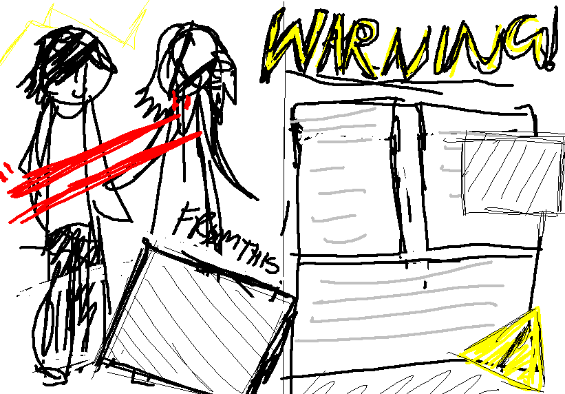
This is the sketch version of the double page that was created in MS Paint for basic design/drafting.
I then had to create some text for the article. I met up with some members of the (ex) band and they played along with an interview for my project of their fake reunion, creating a believable and useful interview/article for me to write into my magazine to make it look more realistic..
This would be the article;
WARNING
They're finally back and they're bigger, better and brilliant!
Warning originally started in August 2007, where a group of young boys decided they wanted to create and share their rock music to the world. Originally starting with John Godly, the band grew and gained itself a total of 5 members;
Craig Edmonds (Vocals)
Scott Edmonds (Lead Guitar/Backing Vocals)
John Godly (Drummer)
Alex Sutton (Bass Guitar)
William Brackfield (Rhythm Guitar)
Warning quickly became one of the most well known unsigned bands in the south of London
...however, as of January 2012, Warning had all finished their exams and education related problems and finally decided to start again, but more mature and with a whole lot more experience! We caught up with the young lads and asked them about their now reborn musical careers...
"How does it feel to be back?"
"From the looks of it, people who were fans of us before are finding it weirder that we're back than we are! People probably didn't expect to ever see us again... but no, we decided to bug everyone with newer music instead. But yeah, it was a little awkward at first as we'd all been apart for a few years... but in after a while we all realized our talents were all still there and thus inspired us to start playing again." - Alex
"Do you feel you've grown up a lot from before?"
"-giggles gingerly- HELL NO, you really don't remember us at all do you?" - John
Warning told us how not much has really changed between the members except for usual lifestyle choices such as some having jobs or being at university or having relationships etc. Other than that, they all agreed that they were still 'that freaking awesome' band that everyone loved before hand. They did still however agree that their drummer still looked around 12 years old... (This joke is looking like it'll carry on to his forties at this rate!)
"What will you be doing first?"
Warning told us how, other than practising and 'waking up' again, they will be focusing on renewing and re-enchancing their performances from their youth, whilst hopefully gaining back their old and hopefull new fans. They will then start working on some new songs too apparently...
When asked in the interview, it was revealed that they're currently working on a brand new EP album that goes by the name of '12 years'. Craig fed our interest by announcing, "We'll be sure to let ya'll know about it when it is near released. Hope you're as excited as we all are!"
It was also said that we should expect to see even stranger gigs and music than they could have ever made before as kids. The interview then concluded with the lead guitarist wandering into a dark room saying, "Ginger, come here puss puss..."
I then started created my double page spread.
Watch the video below to see the process.
As you can see from the video, a lot of parts of a process went into the double page spreads design. Overall, it took around 3 hours to complete, so a lot of effort went into its creation.
The first thing that I had to focus on was the positioning and placement of the picture of the boys. Once I had masked over their bodies and removed the background, I placed them onto the whole left page to create a very bold and large image. I then began work on the title and tag line. I made sure that these were in a very grimy, rough font along with a bold outline, so that they were one of the things that the viewer would notice first, even if they were just flicking by the page. I also remembered to keep to the major colour palette of yellow and blacks, which is clear in the pages design.
When it came to the actual writing in the article, I made sure to stick to the typical, successful style most magazines have; size 10-12 fonts with bold for titles or italics for exaggeration/emphasis. There was also a quote that I wanted to stand out from the rest that I edited into a bigger, red font. This instantly stands out from the rest and provides a small positive look into the bands thoughts.
Another part of the pages creations was including the older picture/version of the boys. I wanted to use one that showed the loud, childish nature that the band used to have in their youth. This would then be highly contrasted from the photo I took myself, that takes up most of the page. This image is a lot calmer and shows a more mature appearance for the boys, whilst also keeping their fun attitudes clear (e.g. the no shoes costume). Also, by including the words 'from this to this', in the capital letters with exclamation marks, it shows the difference and astonishes people at how they've changed etc.
Final Piece
Open the image, by clicking or opening in a new tab, to see in full quality.
.jpg)
No comments:
Post a Comment