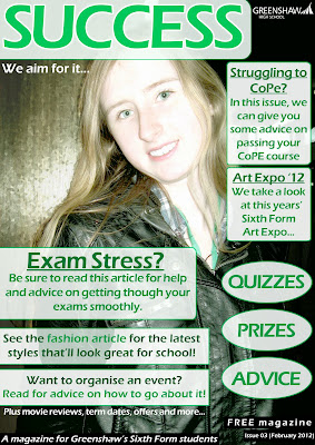
The PowerPoint presentations (hosted by Slideserve) below were created to show my process of creating a front cover and contents page for a school magazine.
Front Cover
The image below is the final front cover page.
Contents Page
The image below is the final contents page.
Overall, I'm quite proud of the results. I think both pieces look very nice and as if they were a real magazine. I'm also quite proud of how professional mine looks. A lot of free school magazines tend to have a very... let's say amateur look to them, whether it be they use bad colour palettes, or don't know how to use layering properly or even just creating the magazines in simple programming like MS Paint. (These tend to look very badly done...)
I do however wish I'd have taken a little more time with the photography aspect, as I feel I may have spent too much time editing the image rather than focusing on the magazines layout.
Another point I am not too proud of/wish I'd have taken into consideration during creation is that the pages do not seem to entirely 'match'. I feel the cover looks a lot more complex than the contents page. However, in my defence, a contents page isn't supposed to be jam-packed with information, it's a summary of what you are GOING to read, extremely brief. Also, the design of it may prove to make the writing a little easier to read rather than have distractions and other places to look like the front cover...


No comments:
Post a Comment