Friday 13 April 2012

Evaluation (Question 4-7)

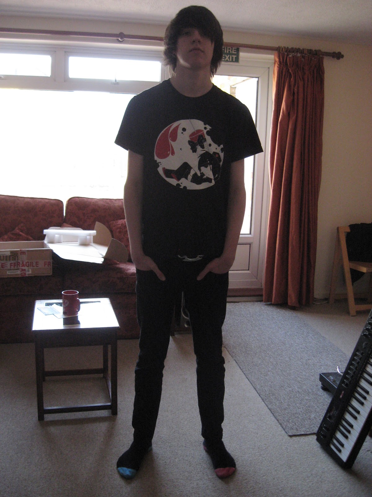
Who would be the audience for your media product?

In the process of creating my magazine product, I had to create, at least, a rough idea of who my target audience would be.It was an essential part of my products design, that without I wouldn't have been able to aim for or target anyone in particular; I would just be assuming everyone in the whole world who like the magazine.
For my target audience I decided upon the following types of people;

  • No specific gender; this is because if you aim something at 1 specific gender, you have to restrict some of the bands you feature and talk about, as some are never listened by certain genders. it also helped for creating the magazine overall rather than having to based it around the stereotypical factors of one specific gender, it is a lot easier to aim at both and avoid disapointment.
  • I also felt that aiming the magazine at white/caucasian people would be a little more useful as there is only a small number of people other than this ethnicity who listen to the type of music I would be presenting. However, this being said doesn't mean I deliberatly or obviously stood out the choice and blocked anyone else from reading it. It is open, it is jsut merely an opinion that I think is accurate.
  • I also decided that it would be best suited and aimed to students or young people in working class. So, BC12 class. This was because people of a higher class would be unlikely to listen to this sort of music due to it's sometimes 'roughness' and lower class just may not be able to afford the magazine or music in general.
  • I also decided that I wanted to target british people more as it seemed a little better to allow the readers see what their own country can produce rather than other countries. It gives a sense of pride whilst reading it.
  • Another point I aimed at was the general interest in music. The people had to like the type of music I would be presenting, metal & alternative. Without this target, the magazine would have been highly unsuccessful. It was also targeted at people who could, probably, afford to buy gig/concert tickets, as we would be advertising them in the magazine.
How did you attract/address your audience?

One of the main audience traits I had to consider was the fact that it was aimed at teenagers and young adults. In all honesty, it's very easy to meet to the the standards of todays youth, as there are a lot of different people in that age group who, overall, tend to like things that all relate to each other one way or another (For example, someone who likes listening to heavy metal is also likely to like someting of the dubstep genre due to these two being mixed in many occasions, particullarly in bigger, more famous bands).
But the fact that the audience would be young means they want modern looks, thing and methods. For example, the feedback I got from youth was all recieved via technlogy, proving younger people prefer to have some form of digital access.
Here are examples of feedback I got from online comments via my YouTube videos or Blogger posts.


From the feedback I got, I can see every single one of them was positive, thus meaning I created a successful magazine. By reading the feedback, I learnt along the way my strengths and weaknesses, thus knowing what to focus on more and improve on.

I also made sure that everything I designed was of the best I could create; modern, colourful yet organised and comfortable to look at. Without a modern appearance, people would be highly put off by what they're seeing and probably refuse to buy it as it seems like an 'old' product, thus being 'uncool'.
I also made sure that everything was laid out comfortably. If there is too much or too little on a page, people get a little agitated and tend to try to avoid the product they are viewing.

What have you learnt about technologies from the process of constructing this product?

I created a powerpoint presentation (hosted on SlideServe) to present my answer to this question.


Looking back at your preliminary, what do you feel you have learnt in the progression from it to the full product?

Since the preliminary, I found that my work had improved, design and writing wise. I feel that the preliminary task was there mainly for students who had no experience with  programs such as Photoshop. Although I found it a little long and tiring doing things that I already knew how to do, I did in the end find that it really helped me in the long run when designing my magazine pieces.


When I put my school magazine in comparison to my music magazine, the latter wins in quality automatically. It's got a lot more thought and effort put into it whereas I felt that the school magazine was a little less organised and looked not quite as professional. The only thing I can say in defense of this is that it was however a lot more professional than most school magazines and leaflets would be, as not a lot of time or effort in generally put into those sorts of projects.
From the preliminary task, I can see my Photoshop techniques have improved dramatically. I became a lot braver with using its tools than I was in the preliminary task, where I tried to keep everything neat and tidy. Whereas in the music magazine task, I went full out and created a loud and crowded (yet comfortable to look at) piece that was, what I like to think, successful.
I also believe my general knowledge for this 'industry' has improved since the first tasks. I learnt about where and what to place on the page that is essential for the magazines sales.

Evaluation (Questions 1-3)

In what ways does your media product use, develop or challenge forms and conventions of real media products?

For this whole project, I had to create 2 print magazines; a school's magazine and one that would be promoting and be based around music. I chose to revolve it around rock/alternative music. For this whole project, I had to do a lot of research and analysis on the generic conventions of these types of magazines and finally designed my own. I had to have a professional look to it as well and include all the pieces that a real magazine would have; barcodes, price, issue dates etc.

Below, I wrote an analysis/evaluation for each of the pieces/pages.
Click or open them in a new tab to view them in readable quality.


How does your media product represent particular social groups?

My product was set to represent a young audience and their interest in music. I didn't make it completely obvious that I was trying to represent the stereotypical features of the target group I aimed for, but I did make sure everything matched up and things would appeal to people of my target audience.


Colour was a big part of my magazine as the colour scheme could really change the appeal the magazine had to my audience. As my audience didn't have a specific gender, I could use any colour I wished as long as I didn't choice a stereotypical fully blue or pink/purple palette. This would have created an undesirable, bias response from genders. It was also essential to use the colour black in my work, as it helped keep the magazine looking organised, non clashing and is typically used for products of the alternative'rock style.
I also had to consider the 'loud' idea of alternative and rock music, meaning I had to use colours that were bold and contrasting rather pastel and soft. The loud colour palette would advertise my product right.


The models on my magazine also had to suit the theme I was going for too. The models (from Warning) were teenage, well built boys wearing typically alternative styled clothing. These were perfect for my magazine luckily, however I did still have to consider other people on the magazine and make sure everyone fit comfortably in the images. For example, I could use an image of someone wearing tracksuit bottoms and not t shirt with a 'dog tag' necklace. This would have been completely different to what you would usually associate with a rock magazine and would match a more rap or hip-hop orientated magazine.


With the class aspect, I had to mainly focus on the idea that it can't look to stuck up. Rock music tends to vary from middle class people to lower class. Higher class are more known for hating the music as it is seen as noise and not comfortable to listen to. So, for this aspect, I had to make sure the price wasn't too high, the bands and articles I featured weren't too 'stuck up' and that everything had a certain sense of mess or imperfection to it. If everything was clean and perfect, my audience would have been highly put off and think that my magazine was just trying to promote a perfect look or way of life, rather than focusing on the fun of the music and how connected people are over the music rather than looks.


Another thing that I worked on was the actual language I used for the writing of the magazine. In a lot of music magazines, they use informal writing with correct spelling and not too much abbreviations (although they are used for words such as 'LOL - laugh out loud'). The reason they use this is to appeal to younger audiences and give off a modern, fun and relaxed attitude to their readers. Some even go to the extent of using explicit language/swearing in their magazines to give people the naughty feeling, however I felt this would have been a little too much for my magazine. I also, spelling wise, made sure everything was spelt 'the British way' so there wouldn't be any mistakes which is just common sense. (E.g. Colour, not color)

What kind of media institution might distribute your media product and why?

I have put my response to this question into a PowerPoint presentation.

All Together Now...


Designing The Contents Page

This is the sketch for the contents page that I will use as a base/draft.


I then started to create the writing that would be placed around the contents page, hoping for it to look as realistic as possible.

Contents

Authors Notes:
Hey guys, Shelley (THE BOSS) here. I would first like to say thank you viewers for buying the first issue of Reckless! Our team here of weird yet wonderful rascals have put in a lot of effort, blood, tears, sacrificed dandelions, sofas, children's tricycles... and possibly a bit of bacon into this magazines creation and I do 
hope you can all enjoy what we have to offer.

Pages
02 - Latest Tour Guides!
03-04 - Download 2012
05 - Bring Me The Horizon
06 - Asking Alexandria Interview
08 -The Sizes
09 - Competitions!
10-11 - Warning
12-13 - Falling in Reverse
16 - The Pretty Reckless
18 - Reckless LOL Moments
19 - Reckless 2012 Summer List!
21 - Acoustic Indifference
22-23 - Gig Guide
24-25 - Feedback & Fan Mail!
28 - Subscription & Issues!
29-32 - Free posters!!!

Subscription
For £5 a month, you can subscribe to Reckless magazine and have it delivered to your door the day the next issue is released!

Here is the process in screen shots...


I first started off with placing the photo's in the structure that I created in the very rough draft sketch. I made sure everything fits on the page already rather than having to distort, transform and majorly edit the images after words and shapes had been placed on to the page. It is a lot easier to work onto photos than it is to work photo's on the other pieces of a page.
I then began adding picture filters, playing with levels and creating a bold, clear appearance for all the photos. This was then followed by me adding more, following my plan, to sort sections and borders for writing to be organised into. I even decided to add in some vector splats and shapes to create an interesting, modern look to the page. This would also follow the usual style of magazines around the same music genre; it's a typically seen factor to their designs.
I also made sure to stick to the warm colour palette of mainly black, white and yellow. This is to emphasize the main article of the magazine and it's theme of warning... relating to a warning sign.


I then began adding text to the piece, making sure to make important/featured articles separate themselves from the main text by placing the page numbers on their corresponding pictures. This is a common technique used in the magazine industry, its so people can automatically find what they are looking for to satisfy their interest. I also created a little 'cute' mascot looking picture that tops the writers notes, it being a little devil/or cat. It's just to create a sense of comfort and fun to the appearance of the magazine by showing something silly.
Then finally, I started finishing up by adding more filter effects and borders around things to make everything stand out boldly and comfortably. I also added the subscription box area, with a red background. It most magazines, you'll notice the subscription box is almost always red or black, never white or any other colour. This may show urgency to its existence and instantly draw the viewer’s attention to the information it is trying to give. The very last effect was a generated yellow and orange cloud effect that was placed as the very top layer. It had Gaussian Blur applied to it to make it softer and was then set to a linear dodge layer setting which, when applied to the page, created a much softer, more professional look to the page.
Final Contents Page
(Open in a new tab or click to see it bigger and clearer!)


Designing The Double Page Spread

This is the sketch version of the double page that was created in MS Paint for basic design/drafting.


I then had to create some text for the article. I met up with some members of the (ex) band and they played along with an interview for my project of their fake reunion, creating a believable and useful interview/article for me to write into my magazine to make it look more realistic..
This would be the article;

WARNING
They're finally back and they're bigger, better and brilliant!

Warning originally started in August 2007, where a group of young boys decided they wanted to create and share their rock music to the world. Originally starting with John Godly, the band grew and gained itself a total of 5 members;

Craig Edmonds (Vocals)
Scott Edmonds (Lead Guitar/Backing Vocals)
John Godly (Drummer)
Alex Sutton (Bass Guitar)
William Brackfield (Rhythm Guitar)

Warning quickly became one of the most well known unsigned bands in the south of London, even playing on XFM Radio live with Alex Zane. Unfortunately, due to the youth's educations, the band slowly grew to a halt and could unfortunately play no more, as of early 2010.
...however, as of January 2012, Warning had all finished their exams and education related problems and finally decided to start again, but more mature and with a whole lot more experience! We caught up with the young lads and asked them about their now reborn musical careers...

"How does it feel to be back?"
"From the looks of it, people who were fans of us before are finding it weirder that we're back than we are! People probably didn't expect to ever see us again... but no, we decided to bug everyone with newer music instead. But yeah, it was a little awkward at first as we'd all been apart for a few years... but in after a while we all realized our talents were all still there and thus inspired us to start playing again." - Alex

"Do you feel you've grown up a lot from before?"
"-giggles gingerly- HELL NO, you really don't remember us at all do you?" - John
Warning told us how not much has really changed between the members except for usual lifestyle choices such as some having jobs or being at university or having relationships etc. Other than that, they all agreed that they were still 'that freaking awesome' band that everyone loved before hand. They did still however agree that their drummer still looked around 12 years old... (This joke is looking like it'll carry on to his forties at this rate!)

"What will you be doing first?"
Warning told us how, other than practising and 'waking up' again, they will be focusing on renewing and re-enchancing their performances from their youth, whilst hopefully gaining back their old and hopefull new fans. They will then start working on some new songs too apparently...

When asked in the interview, it was revealed that they're currently working on a brand new EP album that goes by the name of '12 years'. Craig fed our interest by announcing, "We'll be sure to let ya'll know about it when it is near released. Hope you're as excited as we all are!"
It was also said that we should expect to see even stranger gigs and music than they could have ever made before as kids. The interview then concluded with the lead guitarist wandering into a dark room saying, "Ginger, come here puss puss..."


I then started created my double page spread.
Watch the video below to see the process.


As you can see from the video, a lot of parts of a process went into the double page spreads design. Overall, it took around 3 hours to complete, so a lot of effort went into its creation.

The first thing that I had to focus on was the positioning and placement of the picture of the boys. Once I had masked over their bodies and removed the background, I placed them onto the whole left page to create a very bold and large image. I then began work on the title and tag line. I made sure that these were in a very grimy, rough font along with a bold outline, so that they were one of the things that the viewer would notice first, even if they were just flicking by the page. I also remembered to keep to the major colour palette of yellow and blacks, which is clear in the pages design.

When it came to the actual writing in the article, I made sure to stick to the typical, successful style most magazines have; size 10-12 fonts with bold for titles or italics for exaggeration/emphasis. There was also a quote that I wanted to stand out from the rest that I edited into a bigger, red font. This instantly stands out from the rest and provides a small positive look into the bands thoughts.

Another part of the pages creations was including the older picture/version of the boys. I wanted to use one that showed the loud, childish nature that the band used to have in their youth. This would then be highly contrasted from the photo I took myself, that takes up most of the page. This image is a lot calmer and shows a more mature appearance for the boys, whilst also keeping their fun attitudes clear (e.g. the no shoes costume). Also, by including the words 'from this to this', in the capital letters with exclamation marks, it shows the difference and astonishes people at how they've changed etc.

Final Piece
Open the image, by clicking or opening in a new tab, to see in full quality.


Tuesday 10 April 2012

Designing the Front Cover

The image below this paragraph is the plan that I will be working by for the front cover. This was designed and created based on aspects of the other 3 plans I created earlier on in this project. I used the very simple creative program (MS Paint) to create the sketch so I wouldn't over complicate something that was only going to be redone in the end anyway.


Using, this as a template, I could pile over layers on top of it. View the video below for the process.


The front cover took around 2 hours to fully complete and overall i feel it looks very professional due to it's 'thought out' structure and design.

I first started masking Craig's mid shot photo, removing the background so that I could create a clear image rather than having a noisy background that would be a little too much for the magazines design. I then began adding and placing things such as the title/logo (that I decided earlier on in this project) and adding barcodes, including a QR code; a digital barcode that would lead you to a certain product, place or server if scanned via a smart phone or other similar technology (the one I have on the magazine cover would take you to my media blog here, this creates a little authenticity).

This was then followed on by me placing the other photo's I had prepared for the cover onto the piece. This would represent other featured bands/articles in this magazine. These were all edited and filtered to have an overall warm appearance to them, using the colour pallets brighter colours (yellows and oranges). They were all made to look smooth and soft against the backgrounds rather than sharp and having noise around their edges from where backgrounds were removed, replaced or distorted. This was then followed with creating a rough border in the bright yellow colour I had decided would be the main colour of the magazine's themes.

I then began working on the main imagery; the background and main article (mid shot of Craig). I made a background using cloud (and difference cloud) filters plus one of the texture photo's I took to add to the grubby appearance and style of the magazine. This was all edited to look bold, interesting and soft (as to not remove too much attention from the main imagery on the magazines cover).

When editing the photo of Craig, I used a lot of tools. I first made sure the edges had a nice, clean and sharp look to them to avoid it blending or standing out too much from the background. This was then followed by the altering of lighting and colour levels, along with adding gradients and applying layer effects such as overlay and colour dodge to ensure the image was at its full potential. Once this was done, the rest of the cover was pretty easy to create, just adding more words/writing and borders to objects to ensure everything stands out comfortably and looks professional. The final step involved adding the bands logo (a warning sign) softly in the background using layer effects against the background again. It didn't stand out too much, yet is visible still. It gives the page a little more colour and makes the space to the left of Craig not look as empty.

Final Cover Piece
(Open up the image in a new tab to view it at full size)


Thursday 29 March 2012

Extra Images For Magazine Cover + Contents

The images below are all extra photo's that I have taken or images that I have created that will be used as other material on the cover and contents page. These will represent/advertise other (fictional) bands, articles and events.


The images below show the process of a picture I draw to represent one of the fictional bands on the cover/contents page. It is of an extremely colourful looking 'rock chick' who is wearing clothing that would typically be seen in the 'rock' genre. She's also signalling 'devil horns', a highly recognizable symbol for rock music. It also has a cartoon style to it, barely similarities to bands like Gorillaz.
You can also watch the video below to see the process of the drawing and to legitimately prove the image was created by myself, as I have had a lot of people question and accuse of stealing.


Saturday 24 March 2012

Photography for Music Magazine

This page contains photos that were taken for my magazine design. The 2 boys are the members of WARNING who were available for the shoot, the others were busy. I took a variety of shots, mainly of full body shots as they could be incorporated into mid and close up shots using Photoshop if I desired it.

The clothes that the boys were wearing are what they would usually be wearing; their usual fashion. They're often seen wearing these types of clothes and you can see a clear inspiration from the music genre they listen to (alternative etc).

Things to notice however would be...

· The fact the drummer, John, has no shoes on. This was deliberately done to express his youth in the group (being the youngest) and to show he is the more 'comedic' member who's there to be cocky and make people laugh. It shows a much more silly side to him that would make the viewer feel comfortable when looking at.
· The vocalist, Craig, is wearing a chequered shirt, which is a commonly worn object in the 'alternative' style. With the typical top button undone and the shirt not being tucked in, it shows his scruffiness and an attitude that would commonly be associated with the genre of music I am advertising.
· Both of the boys are wearing the typical black jeans with rough top or jacket look, again typically associated and seen in the rock/alternative genre style.
· I did however tell them not to wear any makeup. These boys do not usually, but a lot of bands of the alternative genre do. But I found it looks a little too dramatic and may fit bands like 'KISS' or 'Black Veil Brides' better than Warning's style.
· I also told them to avoid looking TOO serious. I wanted WARNING to show the magazine a cool, more relaxed and matured style rather than a loud, obnoxious one.


I didn't need to worry too much about lighting, as I was already in a well lit area which would bring out the boys figures and details anyway. However, I did take most of the pictures outside, which is a HUGELY dangerous and unprofessional setting to take pictures in of 'models'. It creates far too much light and can even blur images by wind and lense flares. I did however manage to maintain a still environment and took successful images. I luckily have the power of Photoshop at hand for if I need to adjust any lighting levels or edit any imperfections in the pictures.

The pictures below were also taken during the shoot and are going to be textures or backgrounds for the pages. They will have effects applied to them and their layers so that I can create really cool pages. The 'textures' I went for were all either really grubby, grainy or dusty looking, and objects were all revolved around music. I think these will fit in nicely with my magazine and make it that little bit more interesting.


I will also be using at least one other photo that shows the featured band before they split up. This will be to compare their image to how they are now and show how they've grown up. These photos were all handed to me by the band and I have full right to use them if I desire.